
Written by Dave Bryant, Vice President of Data Analytics
Biplots are among the most commonly used tools for describing and displaying differences of various products or group segments on multiple attributes or product features. Biplots are one of many types of “perceptual maps” which also includes discriminant analysis, multidimensional scaling, or plots of group means on principle components or factors. Biplots are more robust than these other techniques in that they can be used with many types of data, such as means, percentages, and frequency counts. Using a healthcare example, we’ll show how to use and interpret biplots in your research and why you should.
Rating Health Plans Using Biplots
The biplot will be illustrated using data obtained by asking respondents how they rate six health plans on eight different attributes. The attributes comprise a checklist of features and respondents were asked to rate up to four health plans which they were most familiar with. Table One shows the percentage of respondents who agreed that they were satisfied with the brand or that the brand provided that service attribute.
Table One
These percentages are actually product means. For example, 60 percent of respondents are satisfied with Healthplan B compared to only 15 percent of respondents who are satisfied with Healthplan A.
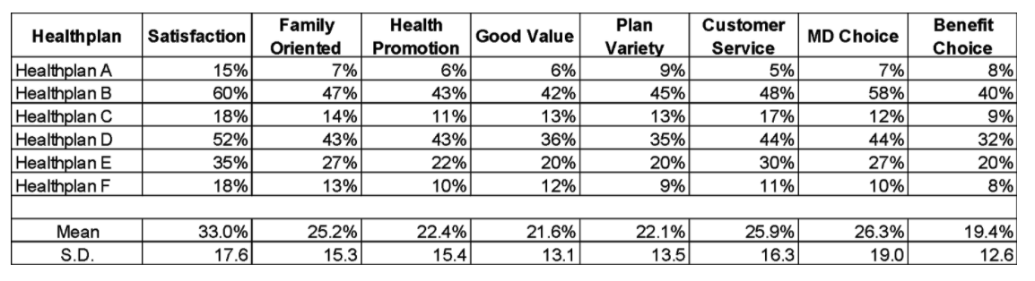
A biplot of these data are shown in Figure One. In this plot, health plans are shown as points and attributes as vectors. We refer to this figure as a “biplot” because both products and attributes are shown on the same plot. Horizontal and vertical references axes have been drawn through origin (0,0). About 84% of the information about the brand differences is captured in this biplot, so it is an accurate representation of the data.
In the lower left-hand corner of the plot, you can see two vectors. These show that 60.7% of the variation is explained along the horizontal axis, while 23.2% of the variation is explained along the vertical axis for a total of 81.1%. Mathematically, this is the cumulative percent of the two Eigenvalues computed during the biplot estimation.
Figure One
Interpreting Attribute Vectors in Biplots
Each attribute vector has two important components: length and direction. The length of the attribute vector indicates the extent to which brands differ on that particular attribute. The attributes with the longest vectors indicate that the brands are most widely separated on this attribute.
In the example we can see that the attribute “MD Choice” is the best differentiator of the brands since it has the longest vector. Inversely, “Family Oriented” has the shortest vector. What this means is that consumers view “MD Choice” as a major differentiator between health plans, while being “Family Oriented” is the least important attribute in terms of discriminating among health plans.
The direction of an attribute vector is best viewed in terms of its angles with other attribute vectors. Angles between attribute vectors represent correlations among attributes:
-
Correlations of zero are show as attribute vectors at 90 degrees
-
Negative correlations as angles greater than 90 degrees.
-
Attributes with large positive correlations will appear as vectors that are close to each other (Satisfaction and MD Choice)
-
Attributes with large negative correlations will appear as going in opposite directions from the origin (Customer Service and Benefit Choice).
Interpreting Brand Points in Biplots
The position of a brand point in the biplot is determined by the means of that group on the attributes. Therefore, distances between groups points on the plot reflect differences between group means:
-
Brands which have similar means on all the attributes will appear close together
-
Brands which are different will be further apart
In our example, Healthplan C and Healthplan F have similar means across all the attributes, hence they appear relatively close together. The remaining health plans are spread around on the biplot.
The direction of the attribute vectors in the two-dimensional space provides a basis for understanding the perceived differences among the brands. Generally, a brand scores higher means, compared to the other brands, on those attributes whose vectors appear in the same region of the biplot as the brand point. As we can see in Figure One, Healthplan A is perceived by consumers as having strong “Plan Variety” and “Benefit Choice.” Healthplan B is perceived as being strong in the area of “MD Choice” and overall “Satisfaction.”
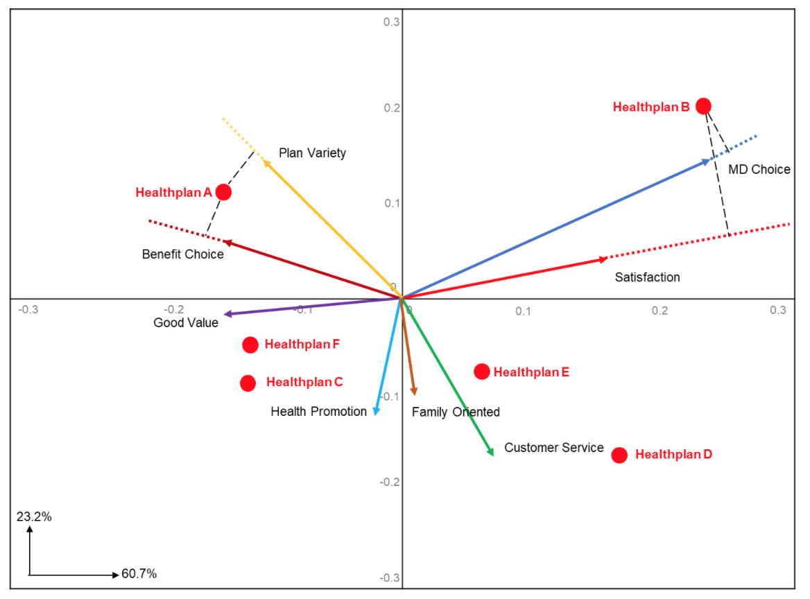
Detailed information about brand differences on each attribute can be obtained by “projecting” brand points onto the attribute vectors. This is done by drawing perpendicular lines from the brand points to the attribute vectors, as illustrated by the broken lines in Figure Two.
Here we have plotted perpendicular lines for Healthplan A onto “Plan Variety” and “Benefit Choice.” Both perpendicular lines map onto the attribute vectors at approximately the same distance from the 0,0 origin, indicating that they are equally strong with Healthplan A.
We also plotted lines for Healthplan B onto “MD Choice” and “Satisfaction.” Here we see that Healthplan B maps higher on the “MD Choice” attribute vector. The same can be done for all the other health plans onto the remaining attributes to derive their strength.
Figure Two
Biplots vs. Discriminant Analysis
Biplots look similar to plots which derive from discriminant analysis. The visual similarity between biplots and discriminant maps arises because the objective of both techniques is the same: to describe group or brand differences on several attributes in a few dimensions.
The computations associated with both are also similar. The major differences between the two techniques are:
-
Complete data for every respondent is required for discriminant analysis, whereas a biplot can be constructed from group means alone
-
The biplot does not require adherence to many of the statistical assumptions at the foundation of discriminant analysis
The choice between the two techniques depends on four factors:
-
The size of the problem (the number of groups or brands and the number of attributes)
-
The scale on which the attributes are measured
-
The nature of the experimental design underlying the data collection
-
The amount of missing data
If you have 25 or more brands and 45 or more attributes, then biplots offer a less expensive alternative. Discriminant analysis requires the collection of precise rating scales whereas biplots can be derived from a checklist of attributes (e.g., “yes” or “no” or “checked” or “not checked”).
Biplots Are Ideal When You Have Missing Data
Missing data is all too common in the research world. In the example above, we asked health plan members living in a specific market to rate the 3 or 4 health plans they were most familiar with. Most respondents were not familiar with all health plans A-F, so we ask them to rate the plans they are most familiar with.
Frequently respondents will have belonged to Healthplan A two years ago but then changed to Healthplan D because they wanted better customer service. That same respondent might have switched to Healthplan B this year because they could not find a doctor they liked while enrolled in Healthplan D. So, over the past three years, they have experienced health plans A, D, and B and are able to rate each plan on the various attributes. Other respondents will be able to rate the other health plans. Discriminant analysis is not possible with so much missing data.
Recapping the Benefits of Biplots
In conclusion, the biplot is the easiest way to organize and interpret a large amount of available data graphically to reveal:
-
Which groups or brands are most (and least) different
-
How the groups or brands differ on individual attributes
-
Which attributes best separate the groups or brands
-
How the attributes are related to one another
Even with an incomplete set of data, like the example shown here, the biplot is an efficient way to present all the features of the data.