
There is a great deal of empirical research demonstrating that customer satisfaction has a positive effect on customer loyalty and customer retention.

At Ironwood Insights Group, we use several unique statistical tools to help our clients more clearly understand how key performance indicators (KPIs) drive customer satisfaction so that they are better able to take the right actions to increase their customer loyalty and, ultimately, retention.
Attributable Effects is a probability-based analysis tool that partitions the impact of each potential KPI into two components: upside and downside. Attributable Effects analysis is designed to yield more actionable information about the preferences of customers and is more flexible than ordinary linear regression because it is not affected by the possible correlation between KPIs.
The goal of Attributable Effects analysis is to identify areas of greatest opportunity (expressed as Upside), and areas of greatest risk (expressed as Downside).
-
“Upside” is the highest possible percentage of satisfaction that could be attained if all the customers who are dissatisfied with a particular KPI became satisfied with that attribute—the opportunity that can be gained from increasing KPI performance.
-
“Downside” is the lowest possible percentage of satisfaction that could be possible if all the customers who are satisfied with a particular KPI became dissatisfied with that attribute—the risk that can result from inaction or declining KPI performance.
The chart below shows a hypothetical example of which KPIs have the largest upside potential and which KPIs have the largest downside potential. The example is for a typical business.
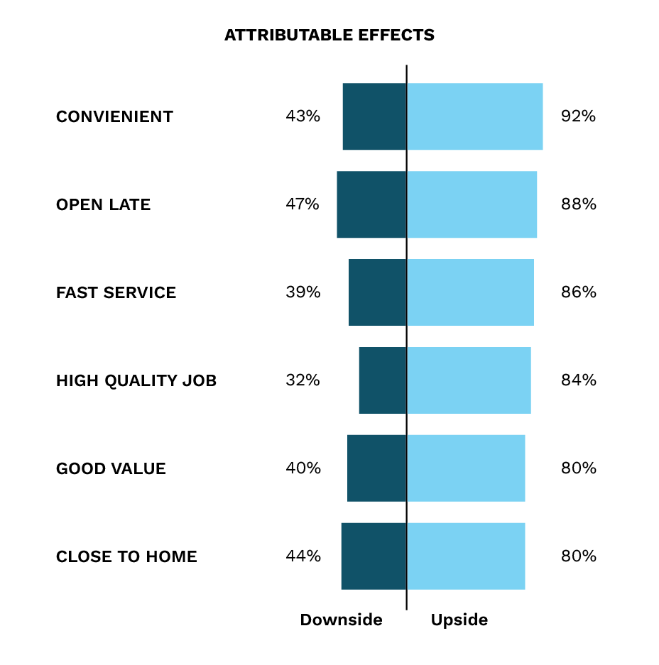
At the bottom of the chart, we see that average customer satisfaction is currently 60%. But, if the business could improve the “Convenient” rating, customer satisfaction could improve to 92%. On the other side of the chart, we see that if the business stops providing a “High-quality job,” then customer satisfaction could drop to as low as 32%.
Attributable Effects analysis quickly helps our clients to understand where they can make efforts to improve customer satisfaction, and also shows them the potential downside effects if they ignore certain KPI’s. This tool helps to identify those attributes that have the largest causality influence on the target measure they are trying to influence, in this case, overall satisfaction.
Graphical Modeling is a quantitative laddering technique that assesses the relationship between attributes and some target measure (e.g., satisfaction, advocacy or even purchase intent). The goal of graphical modeling is to provide insights and guidance into improving the target measure by further exploring the causality that attributes have on each other and, in turn, on a target measure such as overall satisfaction.
Partial correlations are used to uncover the underlying structure of relationships across performance ratings and customer satisfaction. When coupled with other analyses (such as Attributable Effects), Graphical Modeling provides information on which attributes are causing the biggest impact on other variables and therefore offer the best opportunities for improvement in satisfaction.
The output itself illustrates how the various attributes connect with each other and ultimately how they connect with customer satisfaction; culminating in an easy-to-read “road map” that can facilitate development of strategies and tactics for improvement.
In the example below, overall satisfaction is being influenced by two broad categories of perception – “Convenient” (upper half of the graph) and “Good Value” (lower half). Attributes that have little to no impact on overall satisfaction are not shown.
A causal flow is identified by reading from right to left. Attributes at the far right may be considered root causes that impact attributes at the far left, including overall satisfaction. For example, ratings of “convenient” are affected by those of “open late” and being “close to home.” By uncovering these interrelationships, the graphical model defines what being “convenient” means to consumers.
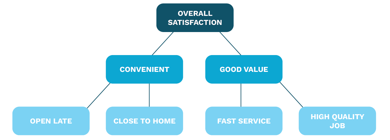
From the Attributable Effects analysis, we know that the attribute with the largest upside potential is the “convenient” attribute. From the graphical model above, we can see that management is going to need to focus on the root causes that drive convenience, namely “close to home” and “open late.” Management may not be able to easily address the “close to home” attribute but can easily address “hours of operation.”
Both of these tools help businesses better understand what is causing high or low customer satisfaction and how they can work to improve those attributes with the greatest impact on customer satisfaction and, ultimately, loyalty.
Contact us to see how we can help improve the actionability of your customer program by maximizing opportunities and minimizing risks associated with key aspects of your business performance.